- Company
- Nodera group
- Platform
- iOS and Web
- Role
- Senior Product Designer and AI builder
- Team
- PM, marketer, back end and front end support
- Timeline
- 2 months
- Year
- 2026
Challenge
The goal was to find an app idea, build the product, and validate whether we could acquire customers at a reasonable cost (CAC), all within two months.
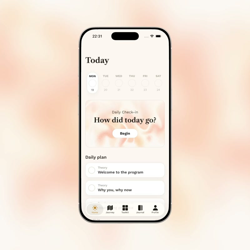
The idea became ResetDay, an iOS and web app that helps people rethink their relationship with alcohol through a 28-day program, daily reflection, and practical tools.
My role & project scope
I led competitor and secondary research, jobs-to-be-done definition, MVP scope, and product design, and collaborated with the PM on market research.
I was the solo developer of the mobile and web apps, using Claude. Developers supported me with project setup, database connections, authentication, and web funnels.
I also built and managed the team's product analytics report and helped create AI-generated UGC videos for Meta ads. The PM led the business side of the project, including stakeholder management and managing marketing campaigns.
- 2 weeks
Research & definition
- 1 month
Design & build
- 2 weeks
Learn & improve
Research
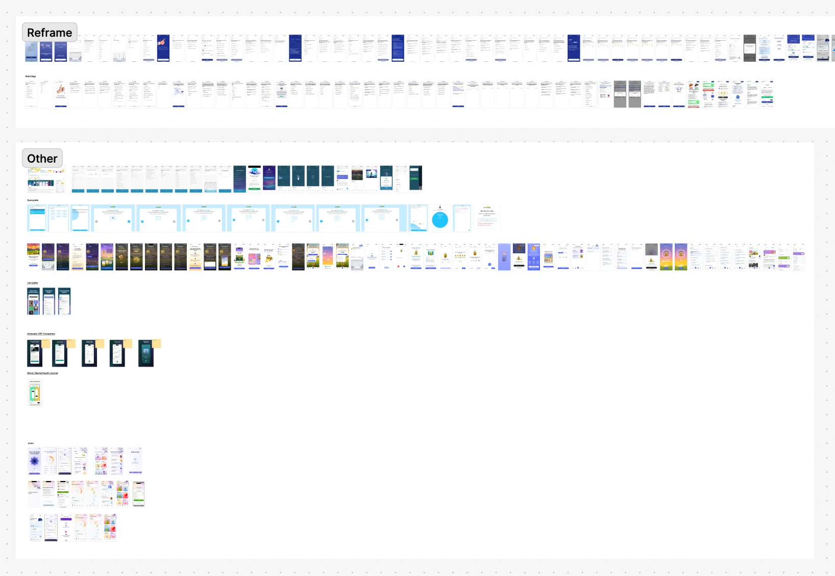
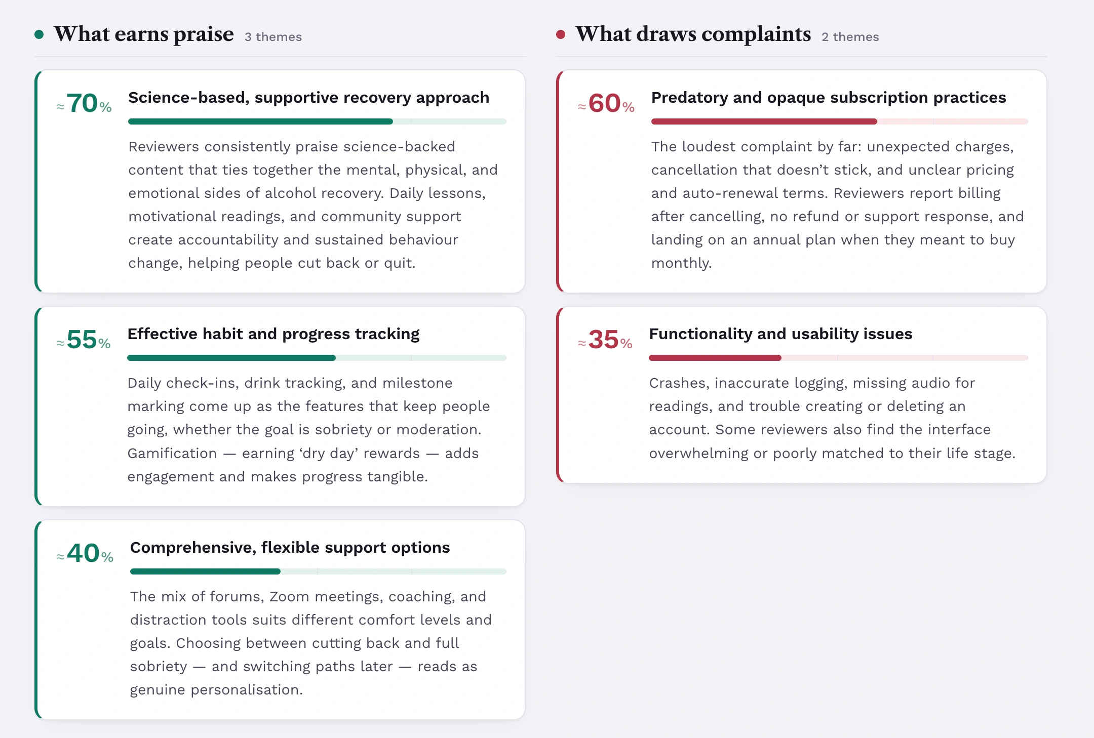
I combined competitor analysis and secondary research to investigate the opportunity, using Perplexity, Claude, and AppFollow to analyze competitors' App Store reviews. We did not conduct user interviews because of the project timeline.
We began with needs and jobs to be done rather than a validated audience segment. The research informed our initial product hypotheses.
Our review of Reframe, the main competitor, led us to focus on program length and relevance. We saw an opportunity to make the experience shorter and eventually more tailored to different needs.
Research insights
The secondary-research synthesis pointed to four possible sources of motivation. These were hypotheses from competitor feedback and related research.
- Personal stakes: Family, relationships, work, and self-respect can make a goal more immediate than abstract future health benefits. A personal reason or photo could serve as a reminder.
- Visible progress: Counters, milestones, and money or time saved can make progress tangible.
- Daily ritual and structure: Morning commitments and evening reflection could give people a simple reason to return each day.
- Feeling understood: Competitor feedback highlighted the value of shared experiences, support, and a space without judgment.
Define
We shaped the direction around CBT-inspired techniques encountered in related apps, connecting educational content with practical exercises.
Our hypothesis was that a shorter guided program, paired with daily check-ins and progress insights, could offer a more manageable starting point. Greater personalization was part of the intended direction; adapting the program to specific segments remained a next step after launch.
I prioritized features by expected value to the user and effort to implement. The jobs-to-be-done board explored how to help someone find an initial reason to engage, establish a daily routine, and see progress. I used those themes to scope the first version around the program, check-ins, journaling, tools, and insights.
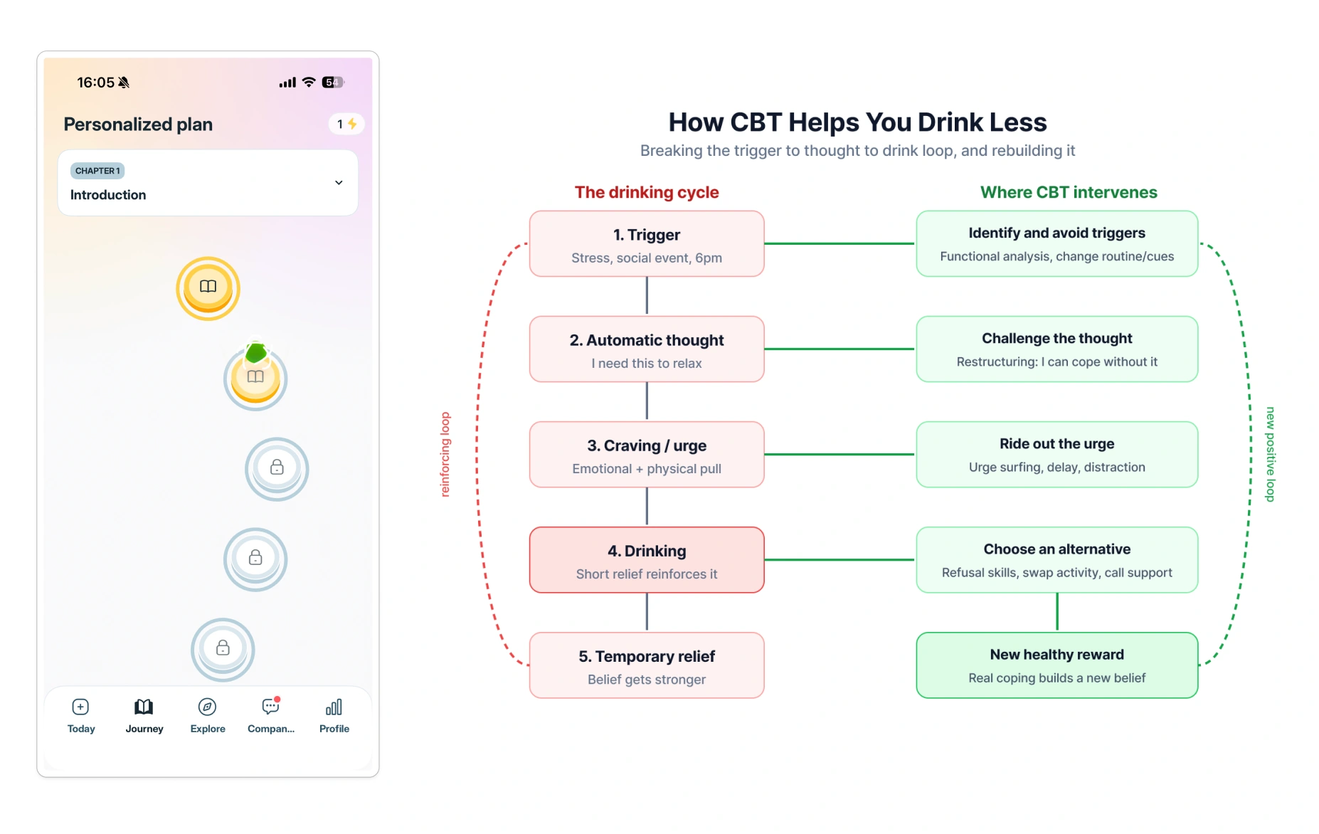
Reframe. Existing solution
Reframe’s main value was content to help users change their drinking behavior, but it was presented as an 850+ day linear curriculum with extensive terminology.
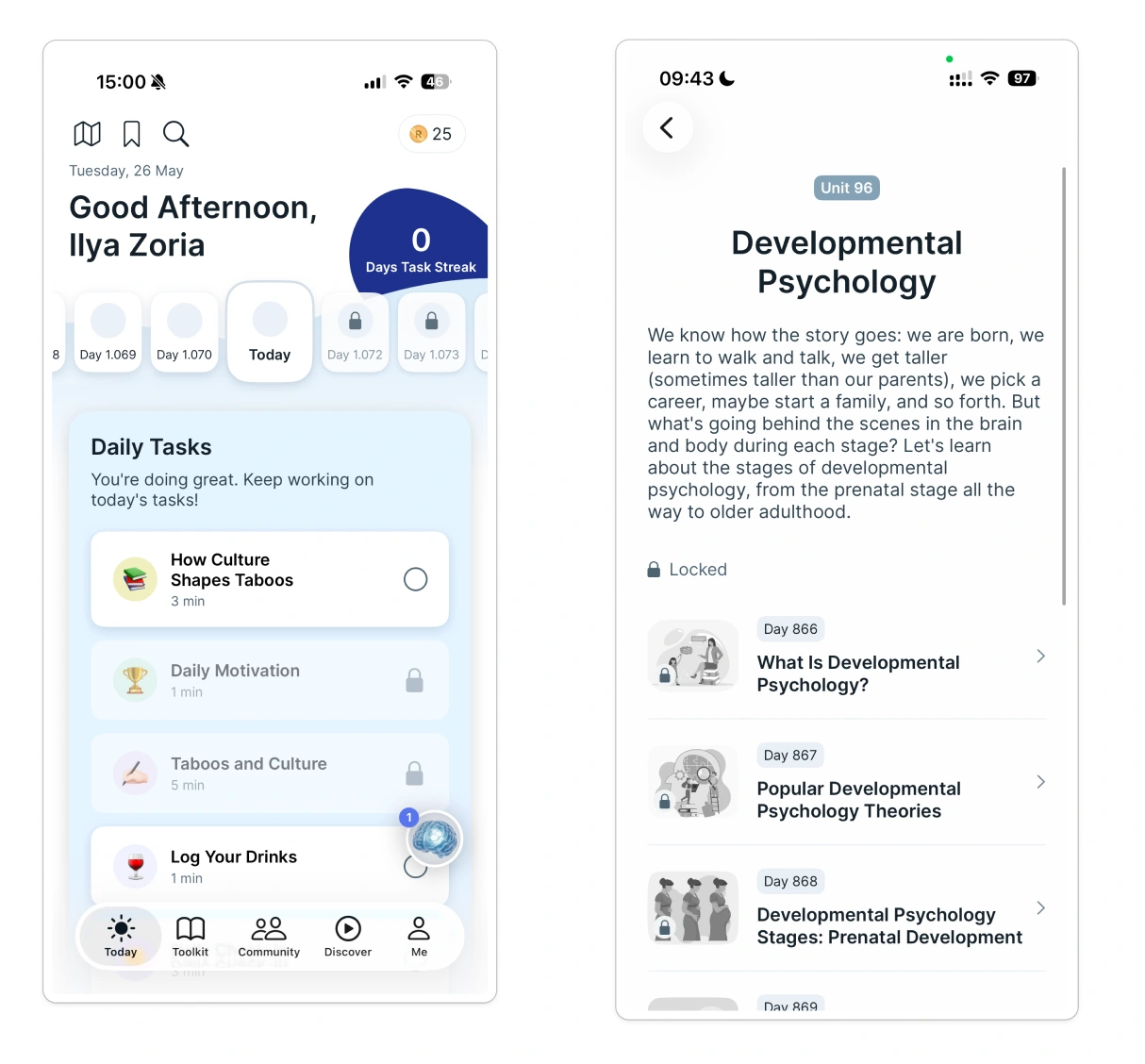
Our solution. Liven for Drinking Less
The early direction was a shorter, non-linear experience combining CBT-inspired theory and practice to help people change their drinking habits.
Early prioritization
I mapped jobs to features to define the MVP and plan future releases. The jobs and features below were our focus for the MVP.
Job 1. Hook me in the first 5 minutes
Identity-based onboarding
Ask who someone wants to become: sober curious, cutting back, or quitting fully. Frame the goal around aspiration.
Personal stake setup
Invite people to write their main reason and optionally add a photo of a child, partner, or themselves as a reminder during cravings.
Goal framing
Explore goals such as quitting, a drink-free days target, or reducing intake, with relevant tracking and content for each.
Job 2. Make progress tangible
Sober day counter
Show a prominent counter to make progress visible.
Money and time saved
Estimate savings from a person’s usual spending and time spent drinking.
Celebrate progress
Celebrate 1 day, 1 week, 1 chapter, and program completion.
Job 3. Give me a daily anchor I actually use
Morning pledge
A short daily commitment, supported by the person’s reason and optional photo.
Evening check-in
A brief reflection on drinking, the day, and a trigger. Record a slip without shame or judgment.
HALT tool
A quick check for hunger, anger, loneliness, or tiredness to help manage cravings.
Ideation & wireframes
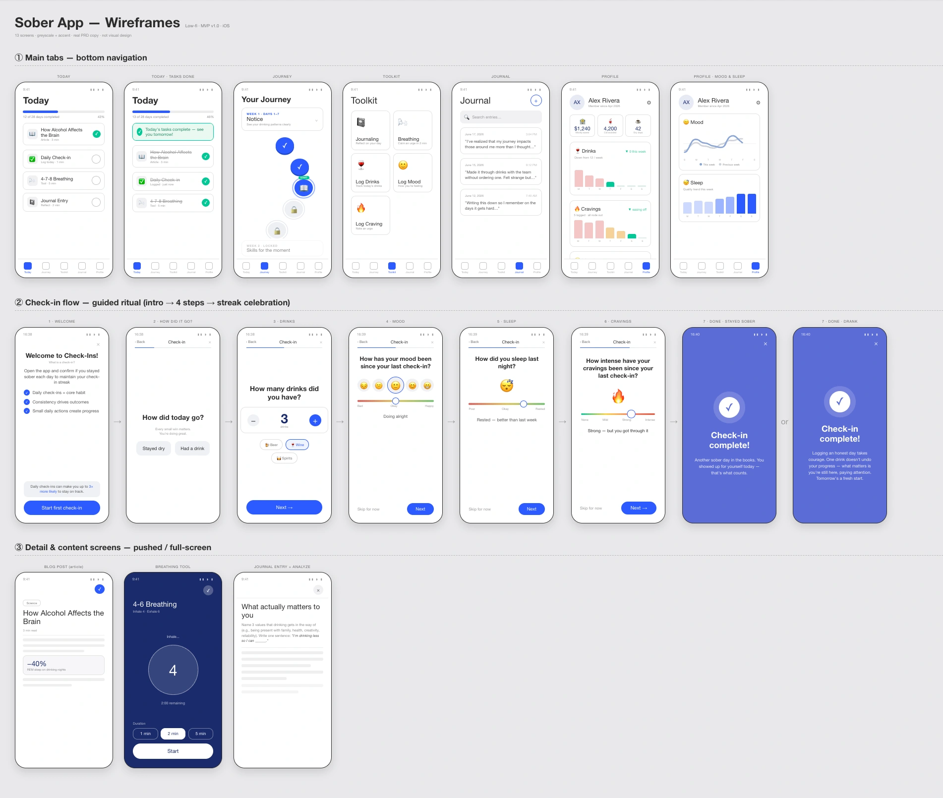
I used Claude to create wireframes for the core experience: Today, Journey, Toolkit, Journal, and Profile, translating the selected jobs into user flows and screens.
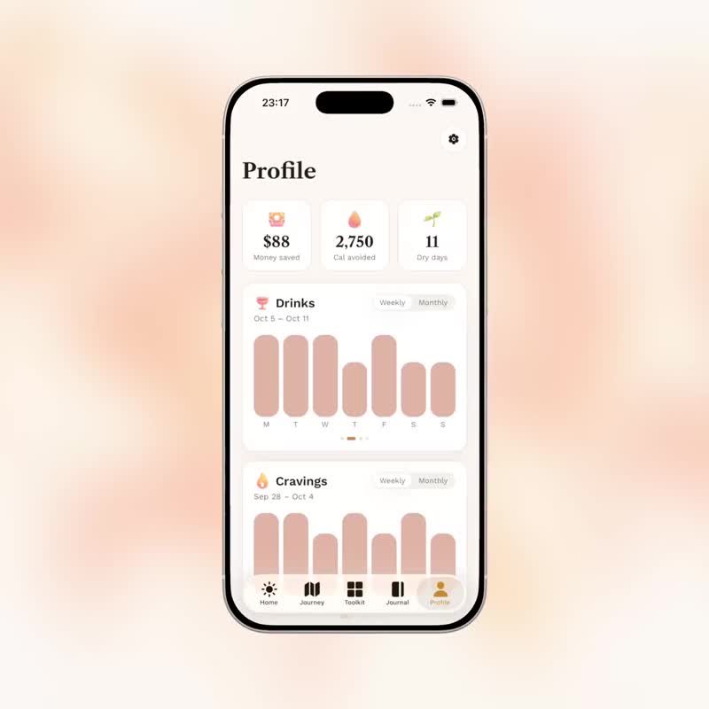
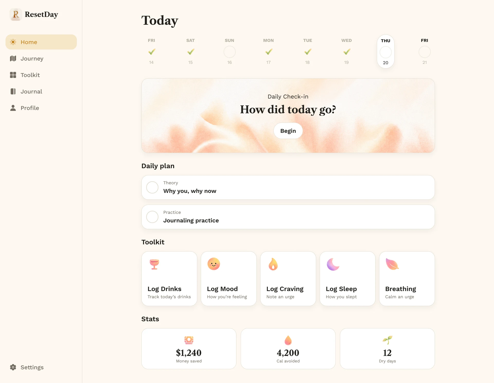
The daily plan connected theory and practice, while check-ins and logging helped users record their experience. Journey organized the program, and Profile brought progress information together.
The wireframes gave me a way to define the relationships between these flows before refining the visual design and implementing them. The first real usage data would later reveal a problem in how program completion and check-ins were connected.
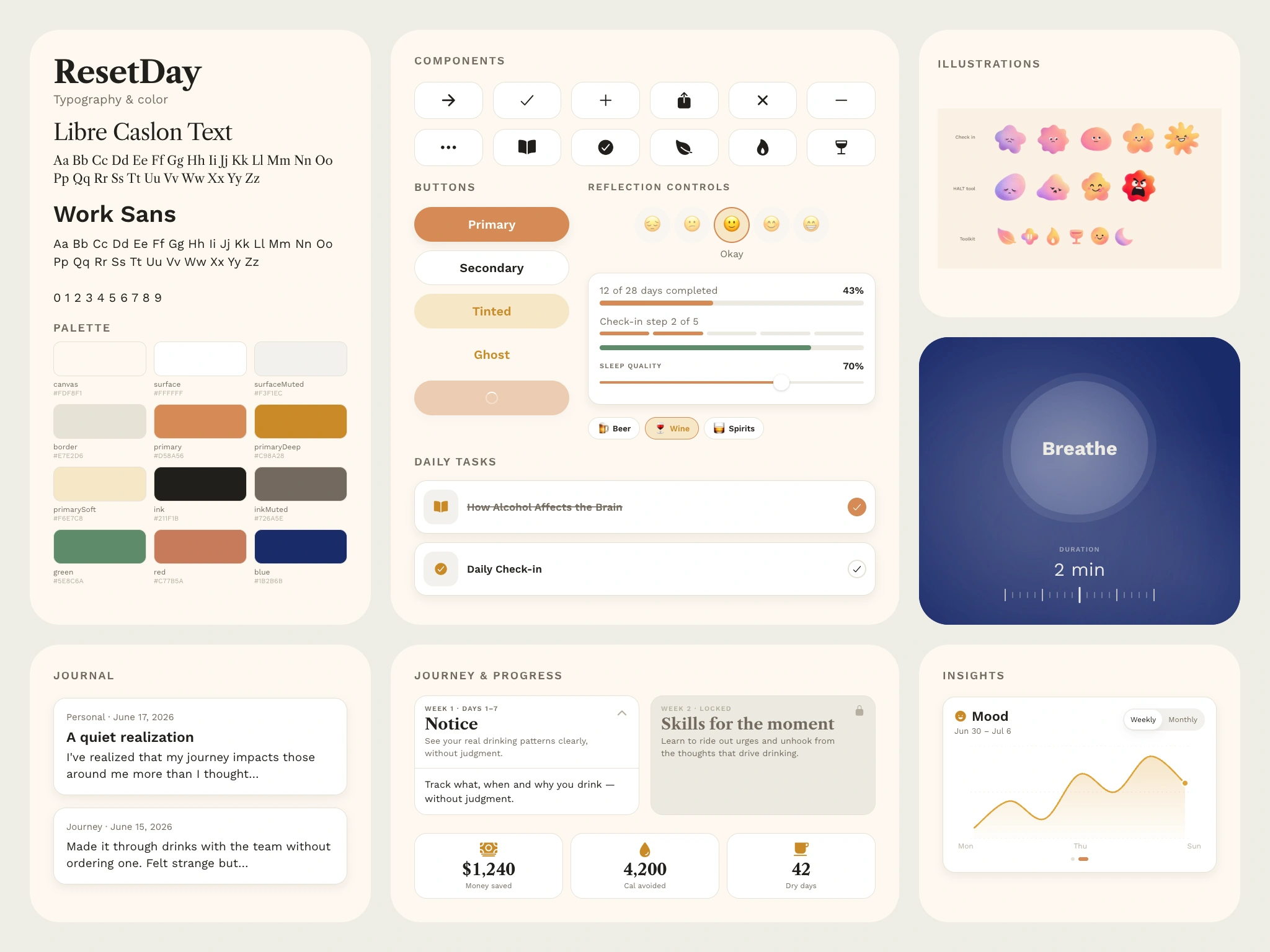
Visual language
I developed a UI kit alongside the product screens, covering typography, color, buttons, cards, input controls, and shared interaction patterns. The same core activities needed to remain understandable across the mobile and web experiences.
The kit included the check-in scales, progress states, daily task cards, and completion feedback. These reusable elements helped connect the visual design to the components I was building.
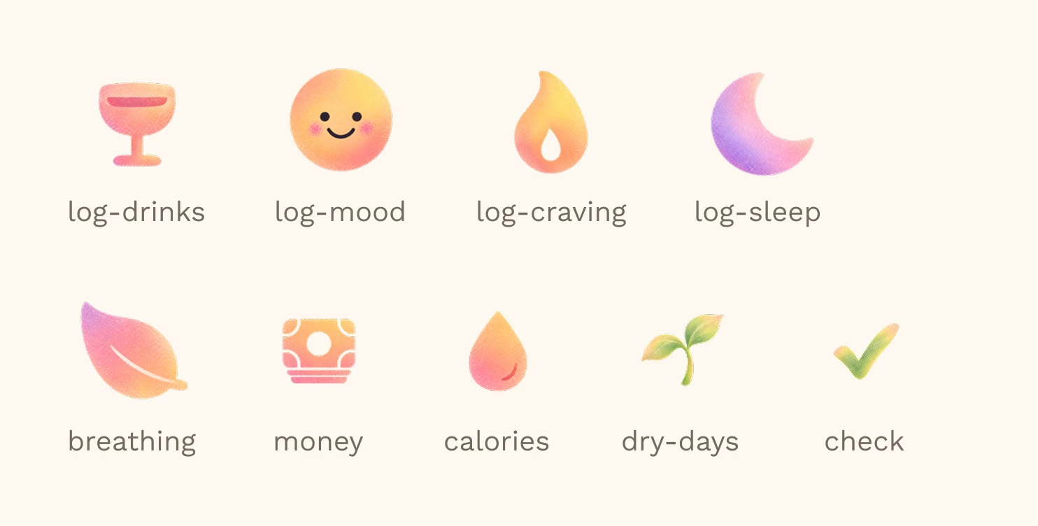
Illustrations
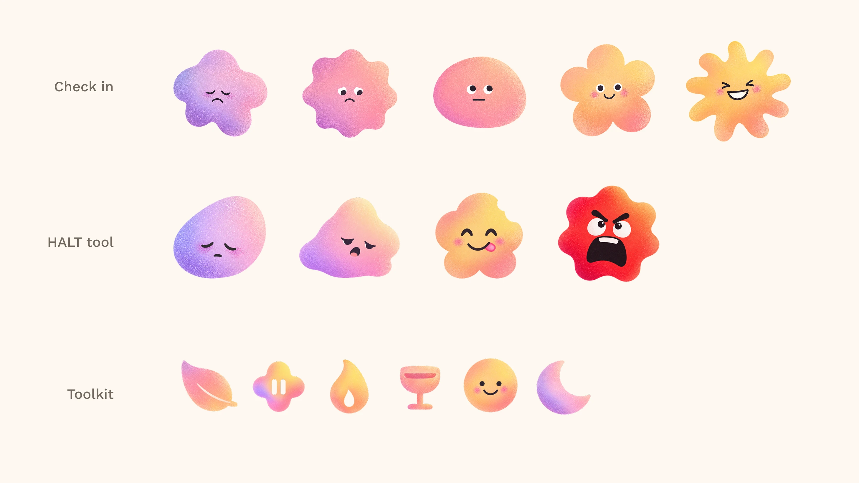
I generated the illustrations with Codex and created a Markdown style guide to keep their colors, textures, and character design consistent.
Product design
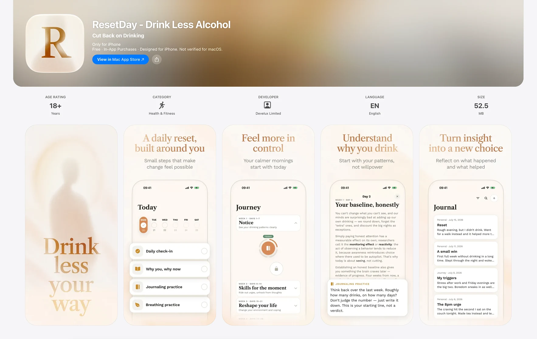
The product combined a 28-day program with daily check-ins, journaling, and tools people could use outside the program. The experience was available on iOS and web.
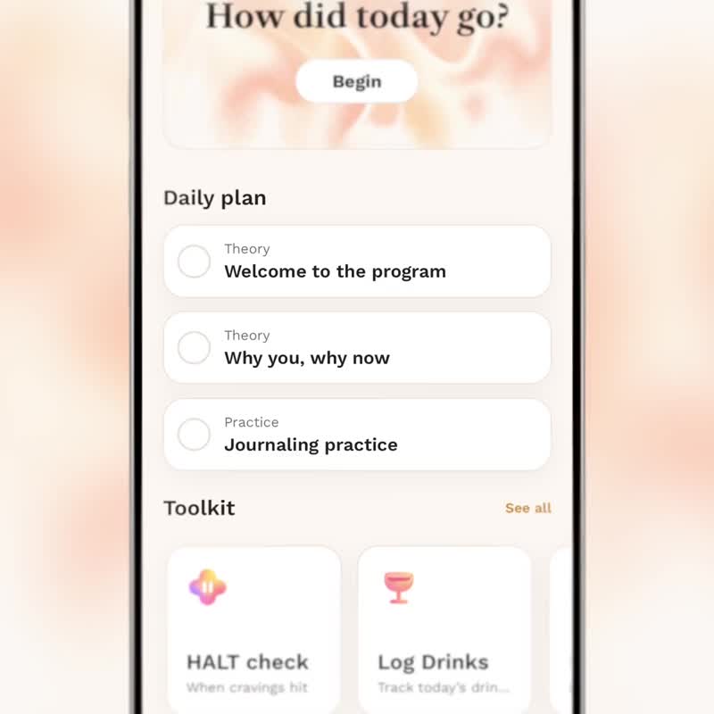
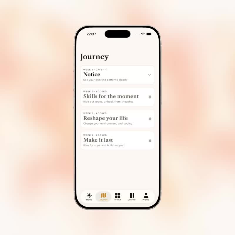
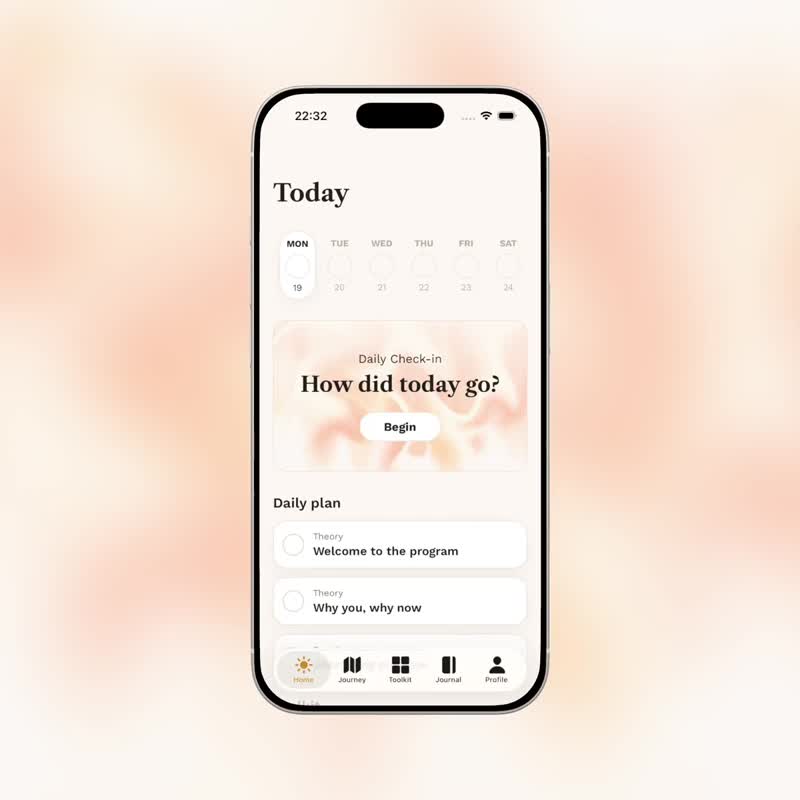
Daily plan and Journey
The daily plan brought theory and practice into a clear sequence. Journey organized the program into days and weeks, giving people a view of what they had completed and what came next.
Check-ins, journaling, and tools
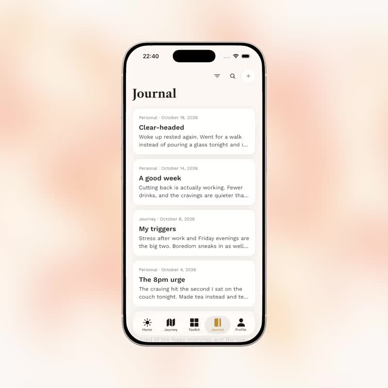
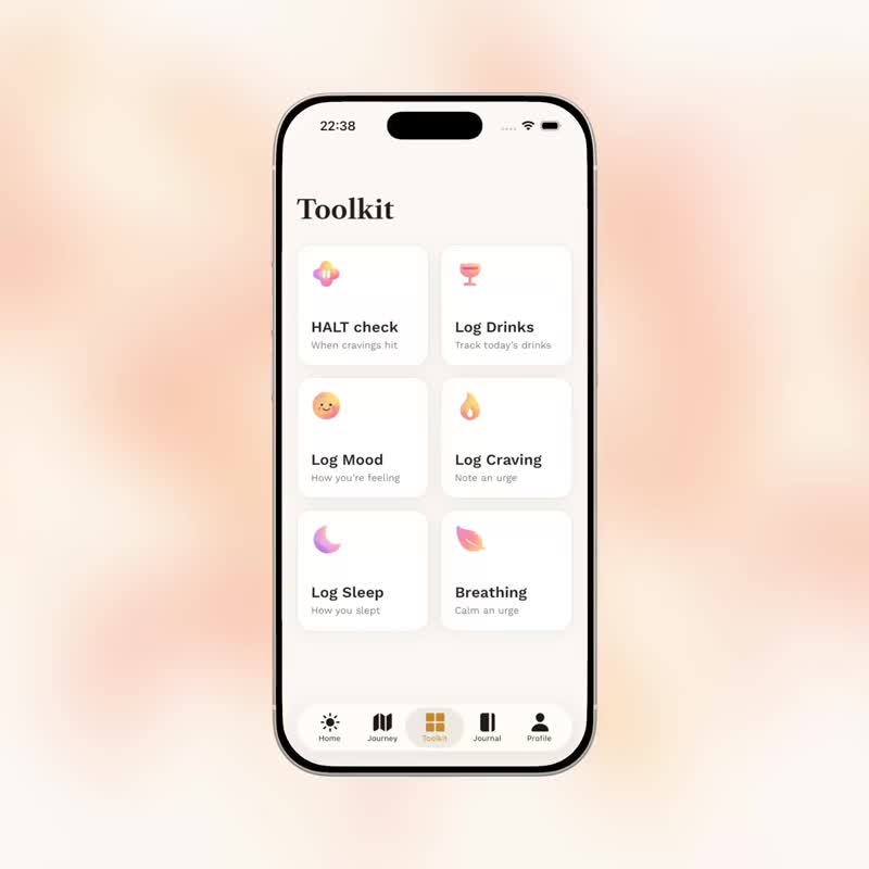
Check-ins let users reflect on their day and record drinking, cravings, mood, and sleep. The journal supported written reflection, while the toolkit provided quick access to logging and breathing exercises.
Free users could complete the first day of the program, make unlimited check-ins, journal, and use the toolkit. The paid plan unlocked the full program and insights.
This scope kept the everyday reflection tools available while reserving the complete guided program and progress insights for subscribers.
From design to release
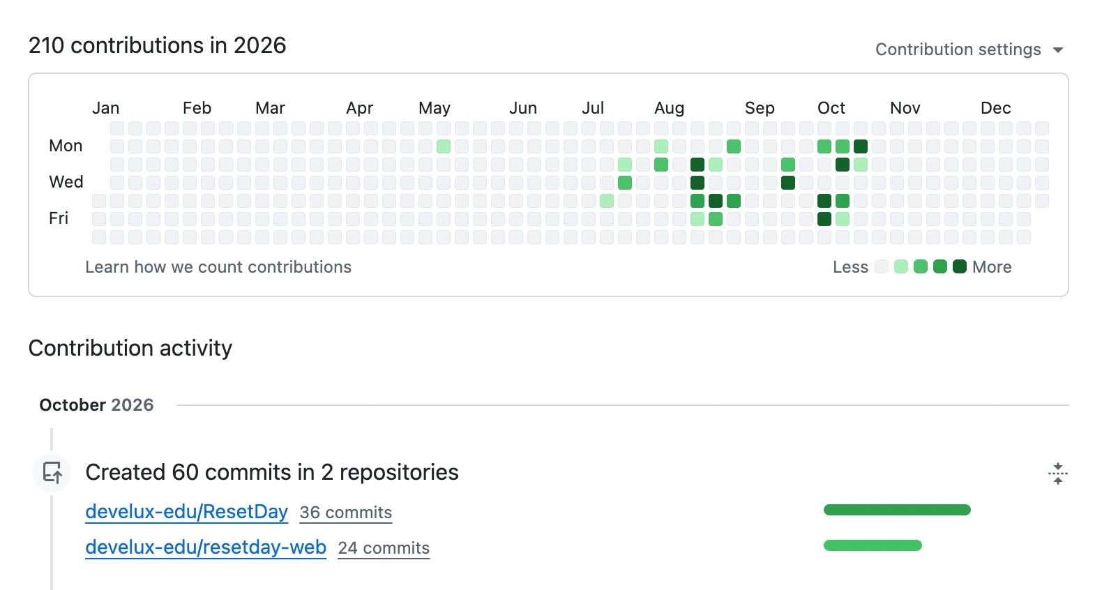
Using Claude, I built the main product experiences in React Native and React. Engineering support covered setup and connections such as the database, authentication, and web funnels, while I owned the application experience itself.
QA focused mainly on the web funnel, payments, and authentication. I was responsible for testing the main product. When I or the team found an issue, I could make the correction and push a release update within hours.
Owning both design and implementation let me carry changes directly into the product and respond quickly to early feedback.
Release
We released the mobile app on the App Store and made the web app available. Alongside the product, I helped create AI-generated UGC-style videos for Meta ads to support acquisition.
The launch gave us a way to observe real product usage, subscription behavior, and the needs of people arriving through the web funnels.
Outcome
Within two months, we researched the opportunity, released ResetDay on iOS and web, and used the first data to improve the daily experience.
The early results provided a baseline for the next product decisions:
- Subscription conversion
- 2%
- Average revenue per paying user (ARPPU)
- $40
- Month-one subscriber retention
- 45%
ResetDay showed promising early product and subscription signals. Web-funnel data also gave us a clearer picture of potential user segments and opportunities to make the program more relevant. However, customer acquisition costs (CAC) remained too high, and the company decided to close the project.
Tradeoffs
The timeline meant starting without interviews or a clearly defined audience. Competitor research, AppFollow review analysis, and Claude-assisted research helped us move quickly, but left uncertainty about whose needs we were meeting best.
I prioritized the first version by user impact and implementation effort. We shipped a guided program and everyday reflection tools, then used product and funnel data to decide where to refine the experience. More targeted personalization became a next step once we had evidence about the people arriving.
What I learned
AI extended the scope of what I could own as a product designer: research, interface design, mobile and web implementation, and an analytics report the team could use together. Engineering and QA support still mattered, particularly around setup, authentication, payments, and funnels.
The most useful learning came after release. A small rule about when a day counted as complete affected how users progressed, and owning the implementation let me respond quickly.
