- Company
- Carerix
- Platform
- Web app · B2B
- Role
- Lead Product Designer
- Team
- Head of Products, 2 Product Owners, UI Designer, 6 Engineers, 3 QAs
- Year
- 2020–2021
- Timeline
- 6 months
About project
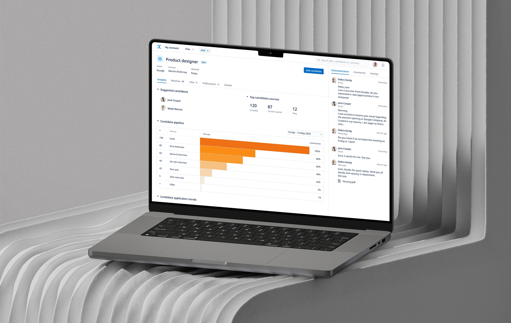
Carerix is online recruitment software for enterprise recruitment and staffing agencies. I was responsible for a new design vision for a 20-year-old applicant tracking system.
The work brought together stakeholder alignment, user research, prototyping, usability testing, and a scalable design system to define the MVP and modernize the recruitment experience.
My role
I led the design from product vision and research through prototyping, validation, developer handoff, and design QA.
- Defined the design vision.
- Conducted user research, desk research, and benchmarking.
- Explored ideas and built interactive prototypes.
- Ran usability testing and refined the experience.
- Created a design system and supported implementation through handoff and design QA.
Team
- The Head of Products and two Product Owners supported the high-level vision and stakeholder management.
- A UI Designer supported the creation of the design system.
- Three front-end developers, three back-end developers, and three QAs implemented and tested the features.
Product vision
We held sessions with stakeholders at different levels to gather requirements, align on goals, and define the vision for the new product.
Assistant
Integrations
Scalability
Carerix before redesign
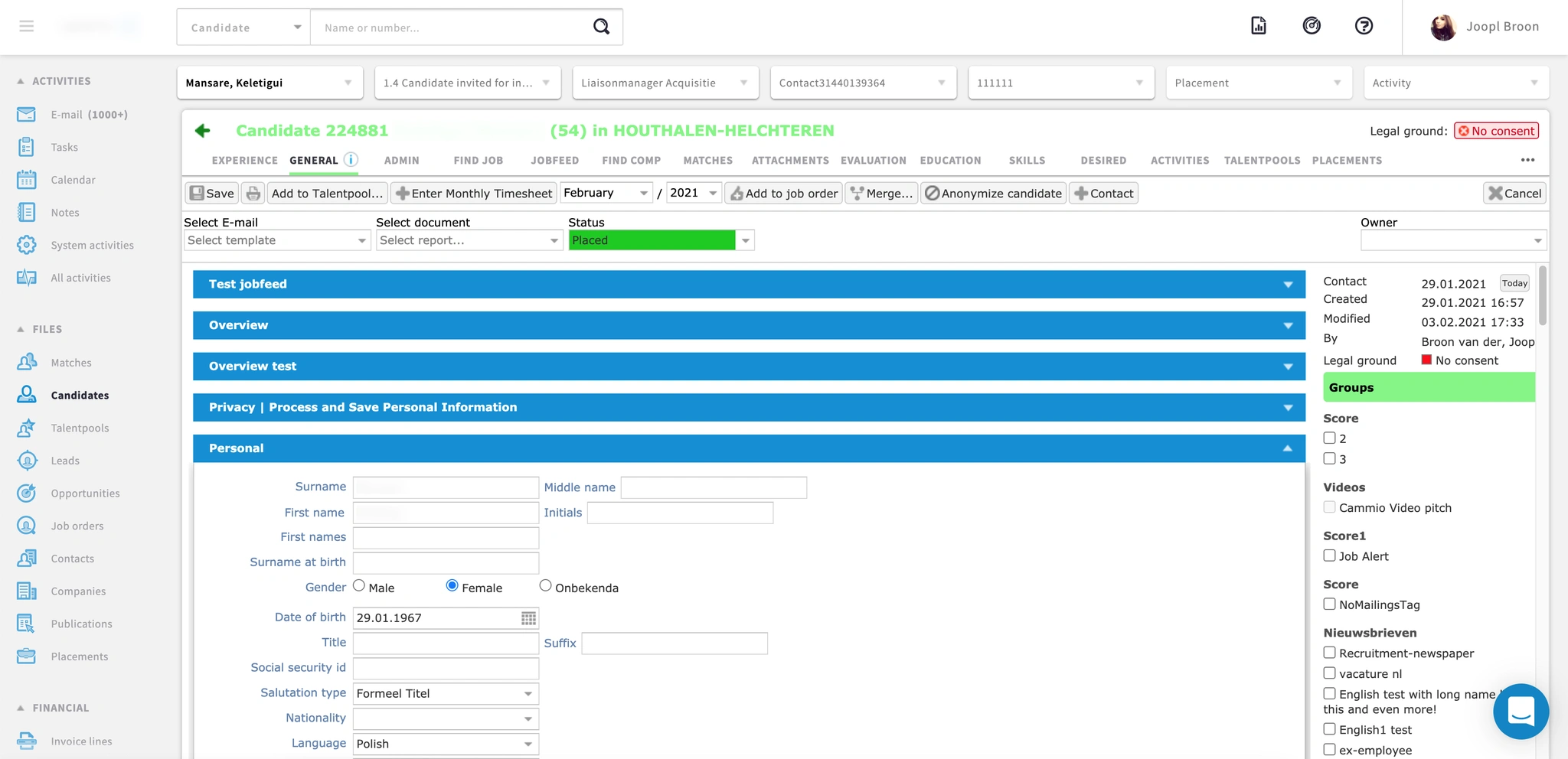
The legacy ATS had a dated UI and a dense, fragmented user experience, with crowded screens, long forms, and many competing actions. Its existing structure limited the ability to scale the product and introduce new modules. Without a shared design system, components and interaction patterns were inconsistent, making it harder to evolve the interface and maintain quality.
User research
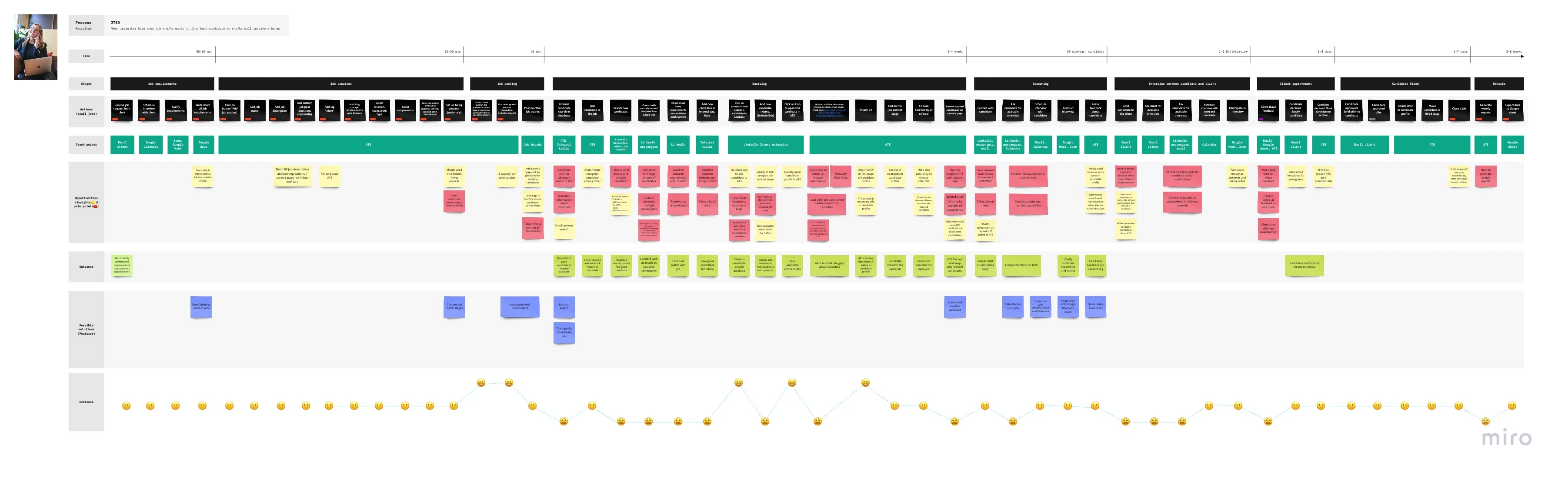
Previous research identified four main ATS personas: Recruiter, Recruiter Manager, Sales, and Admin. To better understand the daily workflows of recruiters and recruiter managers, I conducted five interviews and built a recruiter journey map. This helped identify pain points and must-have features for the MVP.
Key Insights
- Recruiters could manage up to eight open vacancies at once.
- Tags and Boolean expressions helped them find candidates in the database.
- The CV needed to be on the first page of the candidate profile.
- Recruiters used third-party tools to find additional candidate information.
- Sourcing and reviewing suitable candidates took a lot of time.
- Posting to different job boards was time-consuming.
- Recruiters could not customize match stages independently.
- Candidate information was often outdated.
Desk research
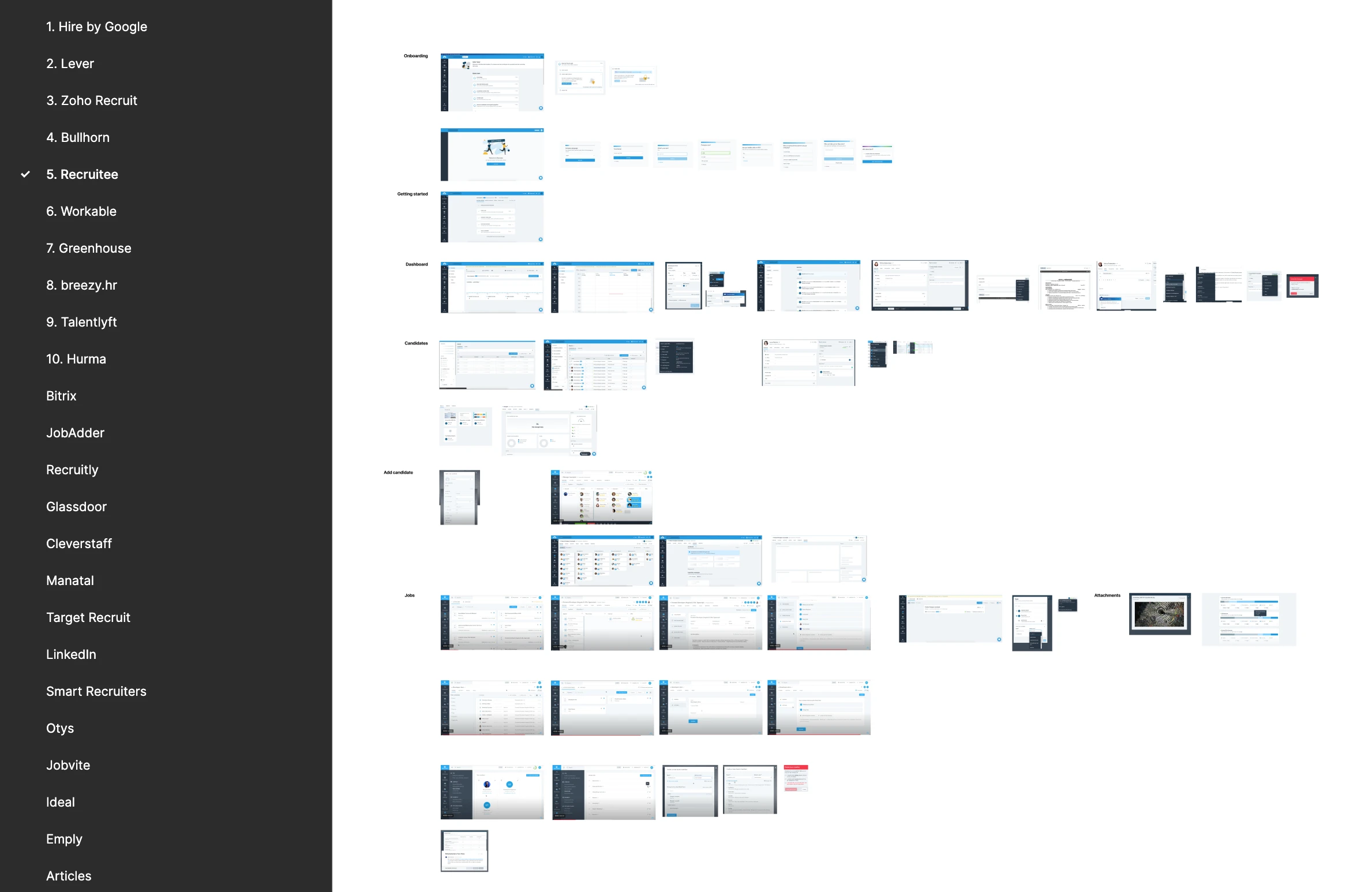
I researched leading CRM and ATS products using G2, product overview videos, live demos, and competitor blogs to understand their features and identify useful UI patterns.
Direct competitors included Hire by Google, Lever, Zoho Recruit, Recruitee, Workable, Greenhouse, and TalentLyft. I also explored patterns from SaaS products including Attio, Airtable, Asana, Dovetail, Linear, Intercom, Notion, Salesforce, Stripe, Zendesk, and Microsoft Teams.
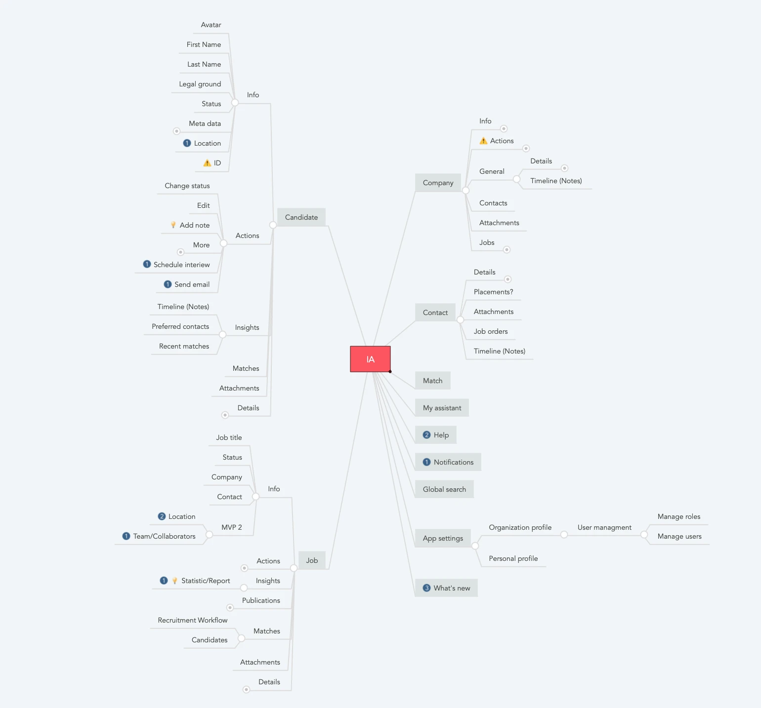
Information architecture
Together with the team, I prepared a shared structure for the core parts of the system so everyone worked from the same source. I mapped the information architecture of the legacy system and defined the MVP functionality.
Usability testing
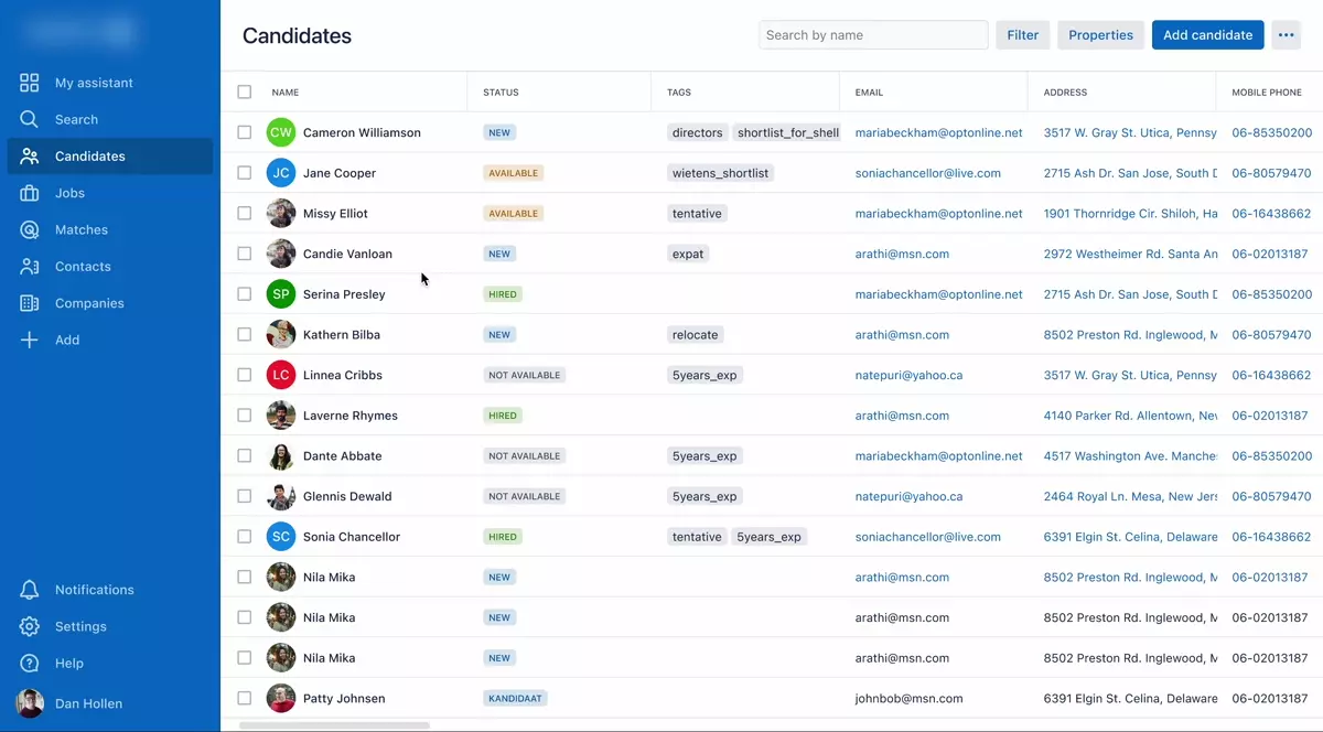
Since we could not test with real customers at this stage, I ran moderated usability sessions with five internal sales managers who worked closely with customers and had recruitment experience. The goal was to understand how they used the new layout and UI patterns and find problems in the main flow.
Key Insights
- The candidate preview was too small.
- Participants could not find the CV in the candidate preview.
- Tags needed clearer explanations.
- It was unclear who had added notes to the system.
- Previewing candidates saved review time.
- The CV was more important than the activity panel.
- Bulk actions were essential for tasks, reminders, emails, and adding candidates to talent pools.
Explorations
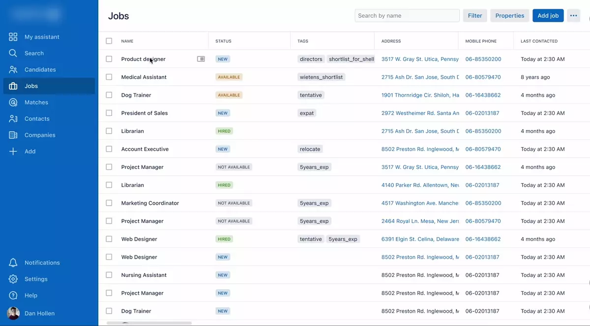
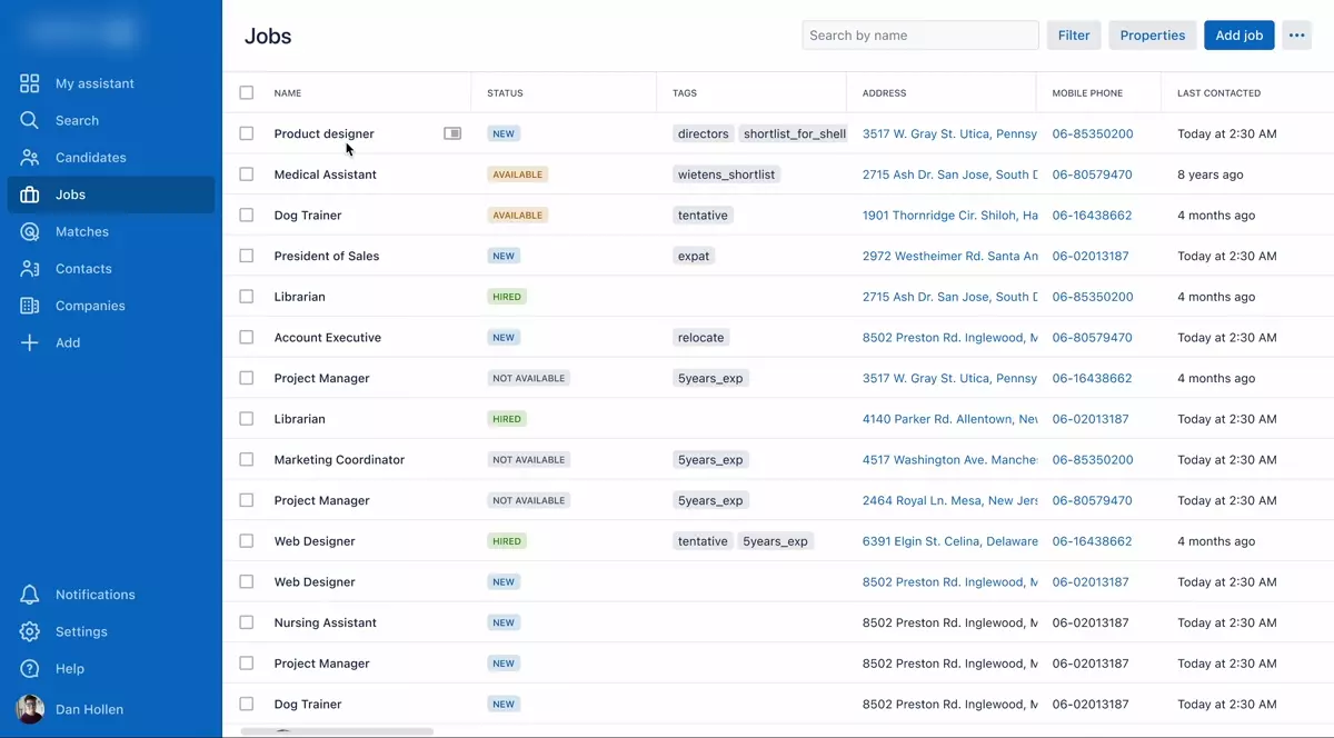
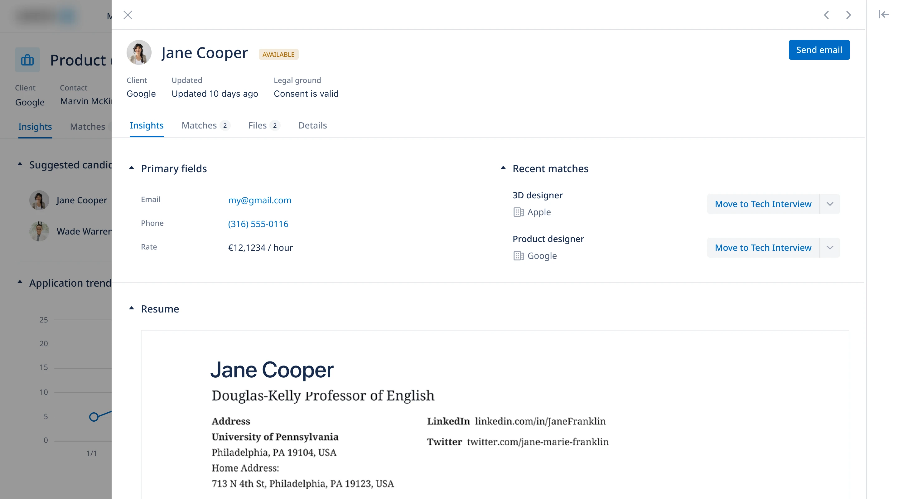
Candidate preview was the main problem uncovered during testing. I prototyped alternative views, and after discussing them with the team, we decided to keep the side-panel approach.
Final design
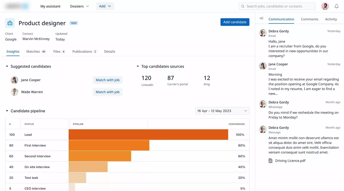
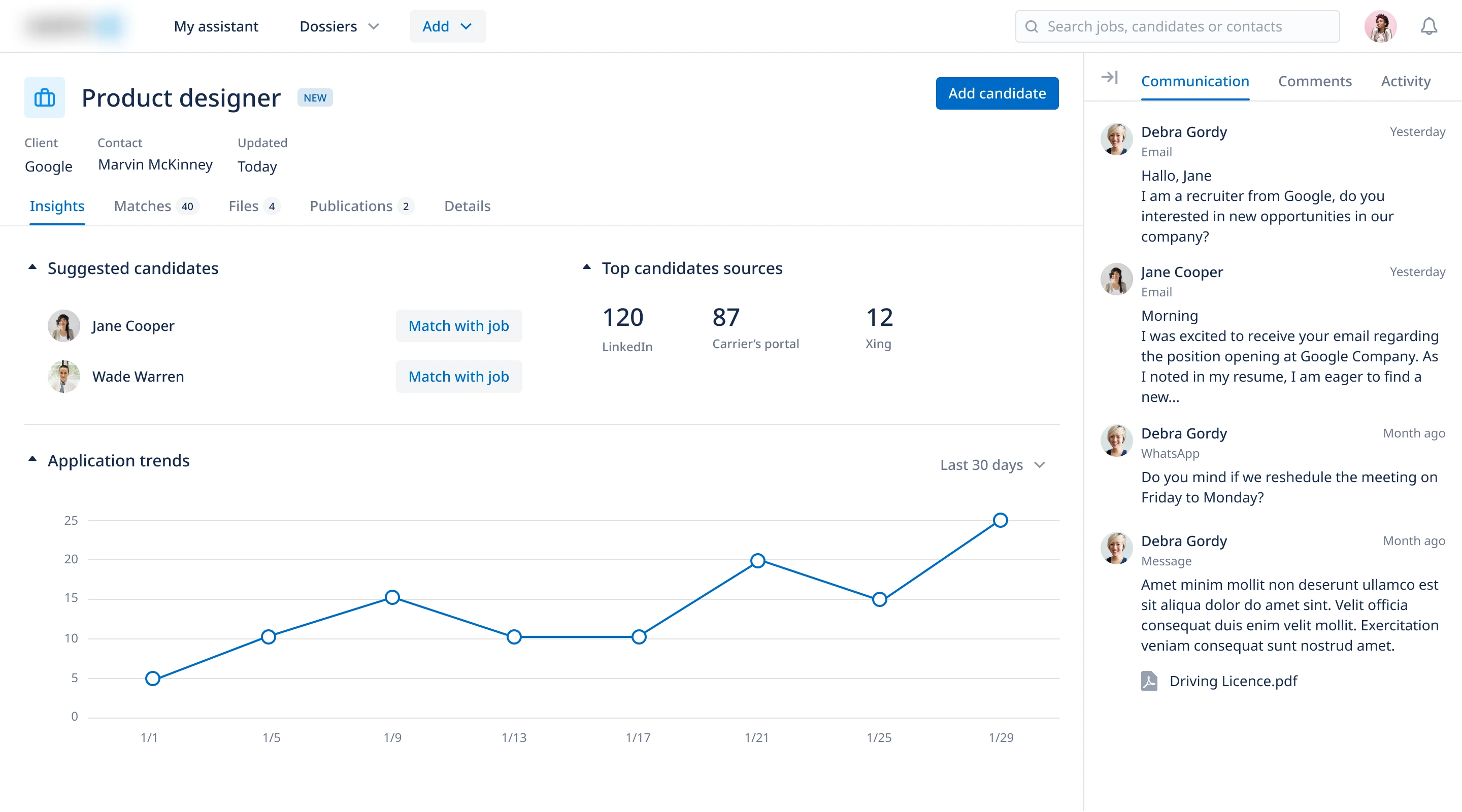
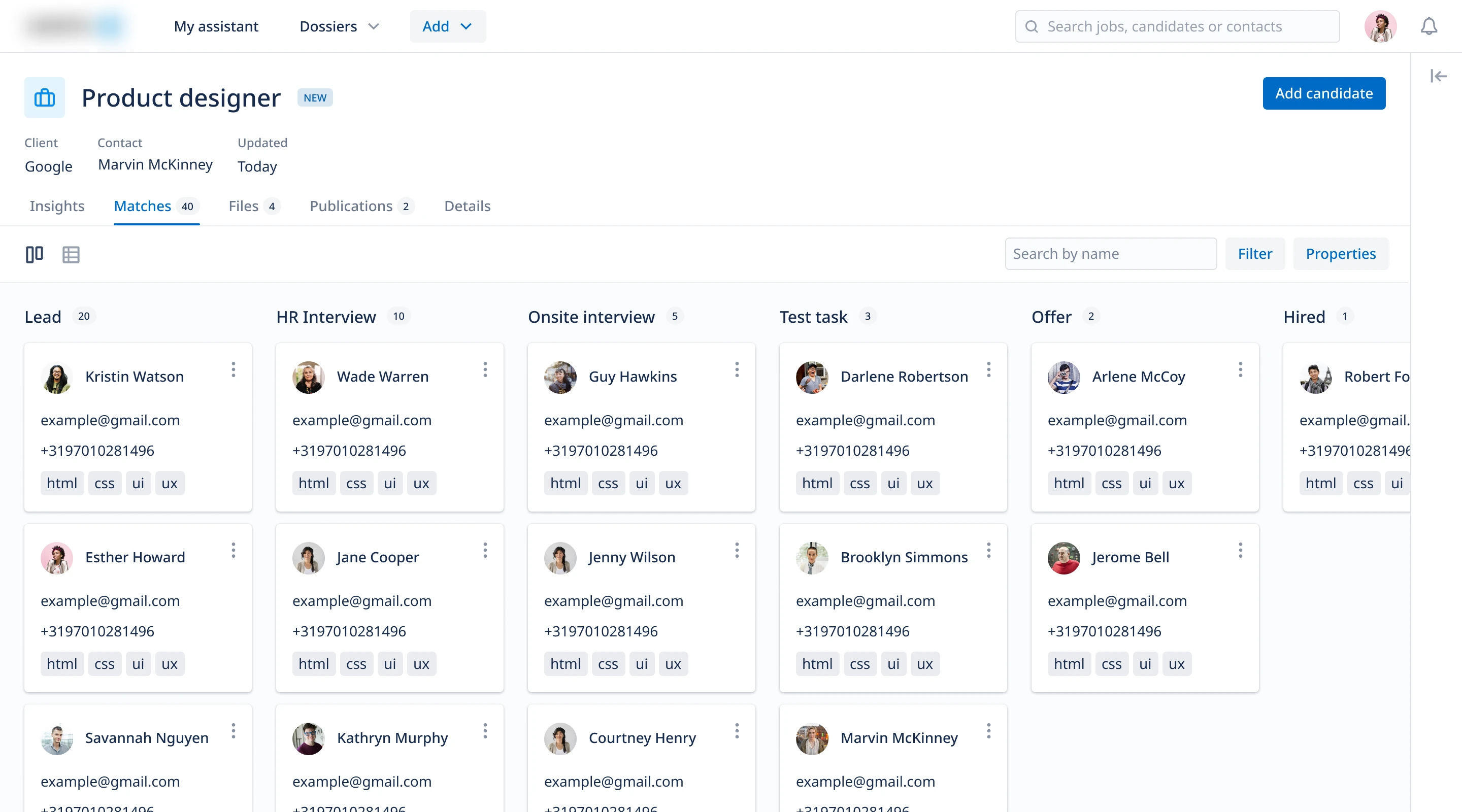
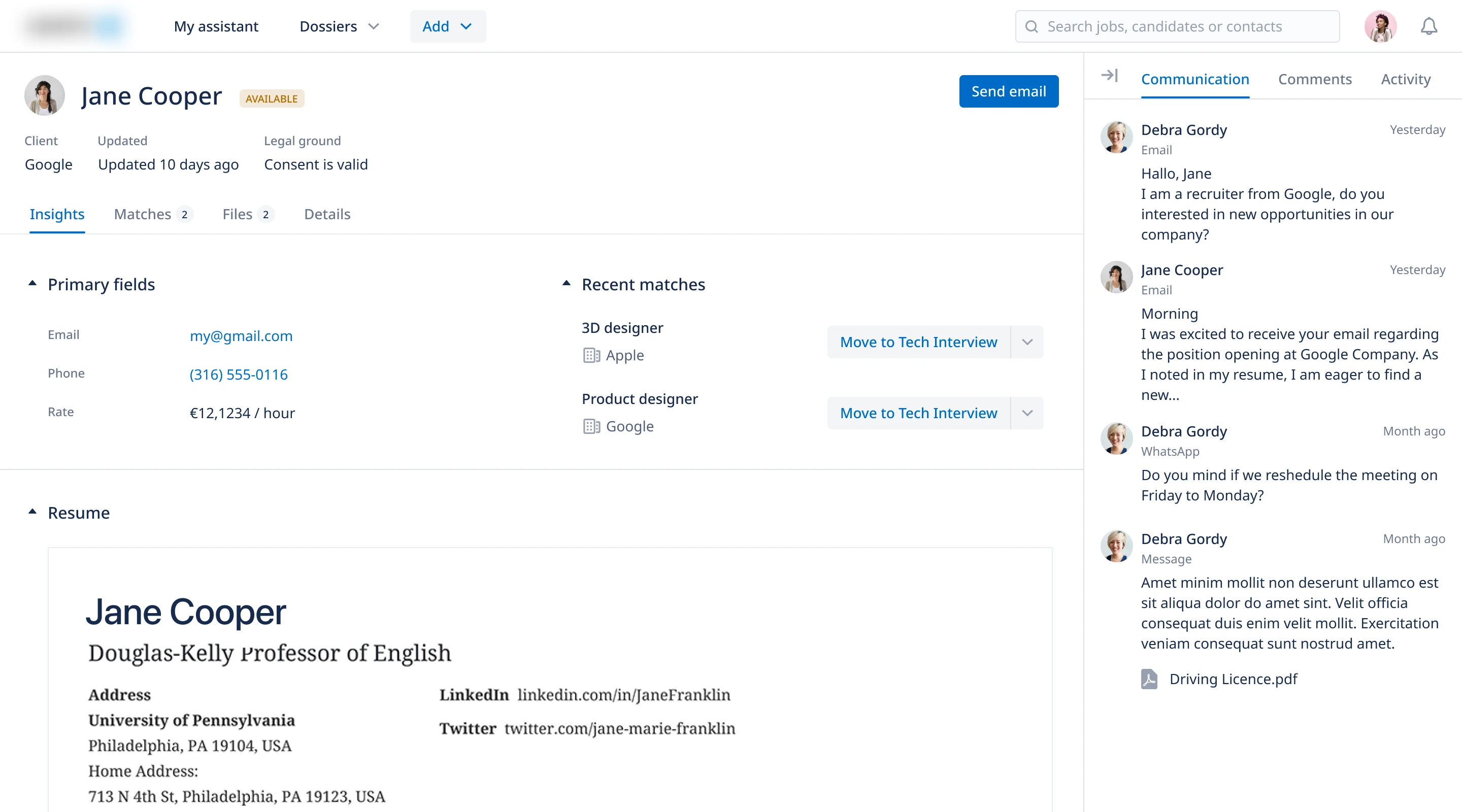
After refinement with the team and new business requirements, we moved from left-side navigation to top navigation. This created more space for content and additional modules such as Activity and Communication.
Design system
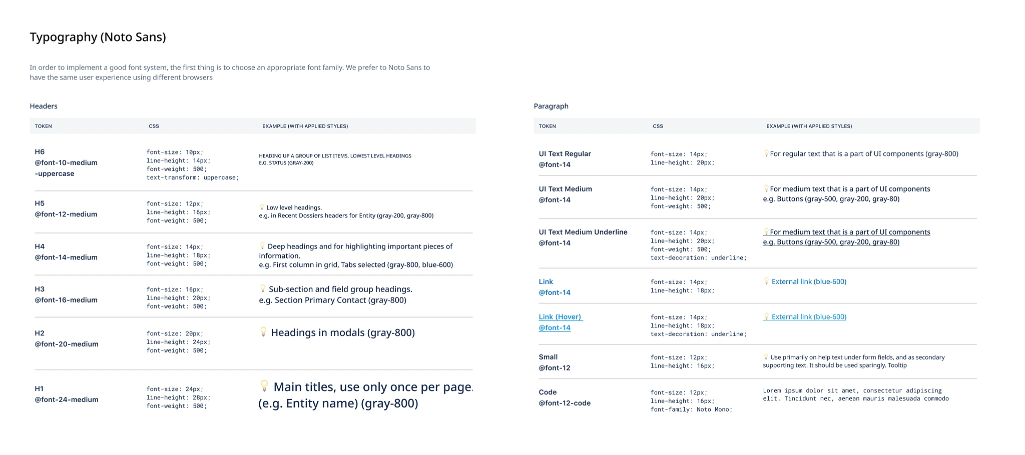
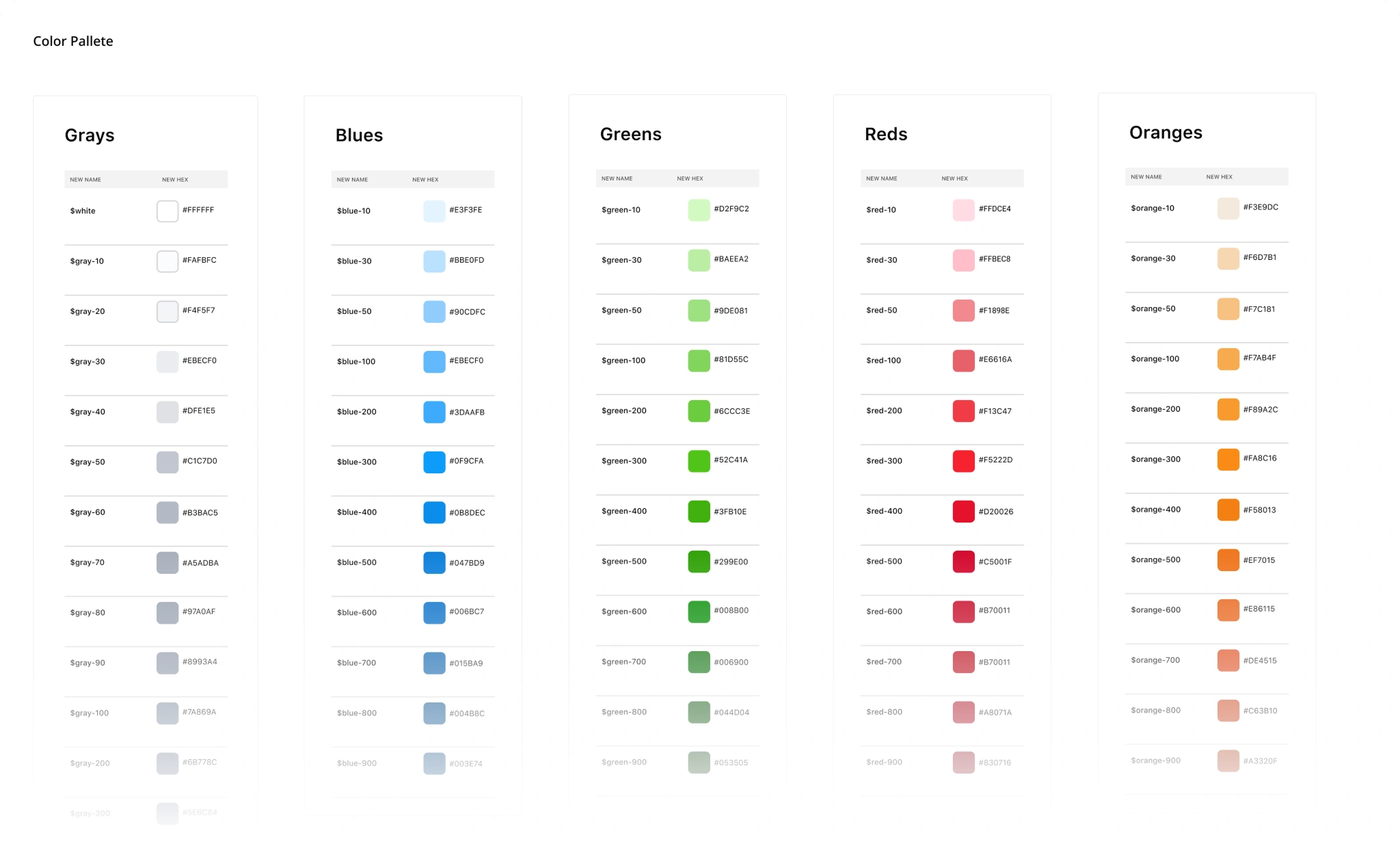
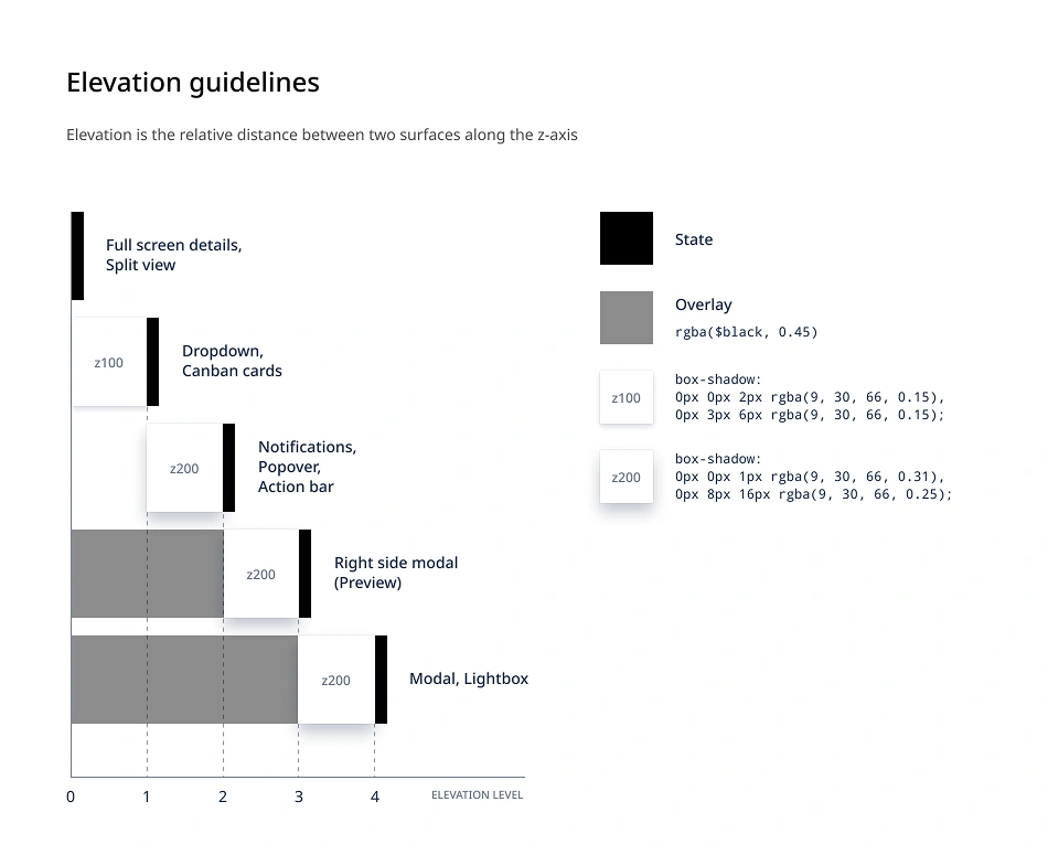
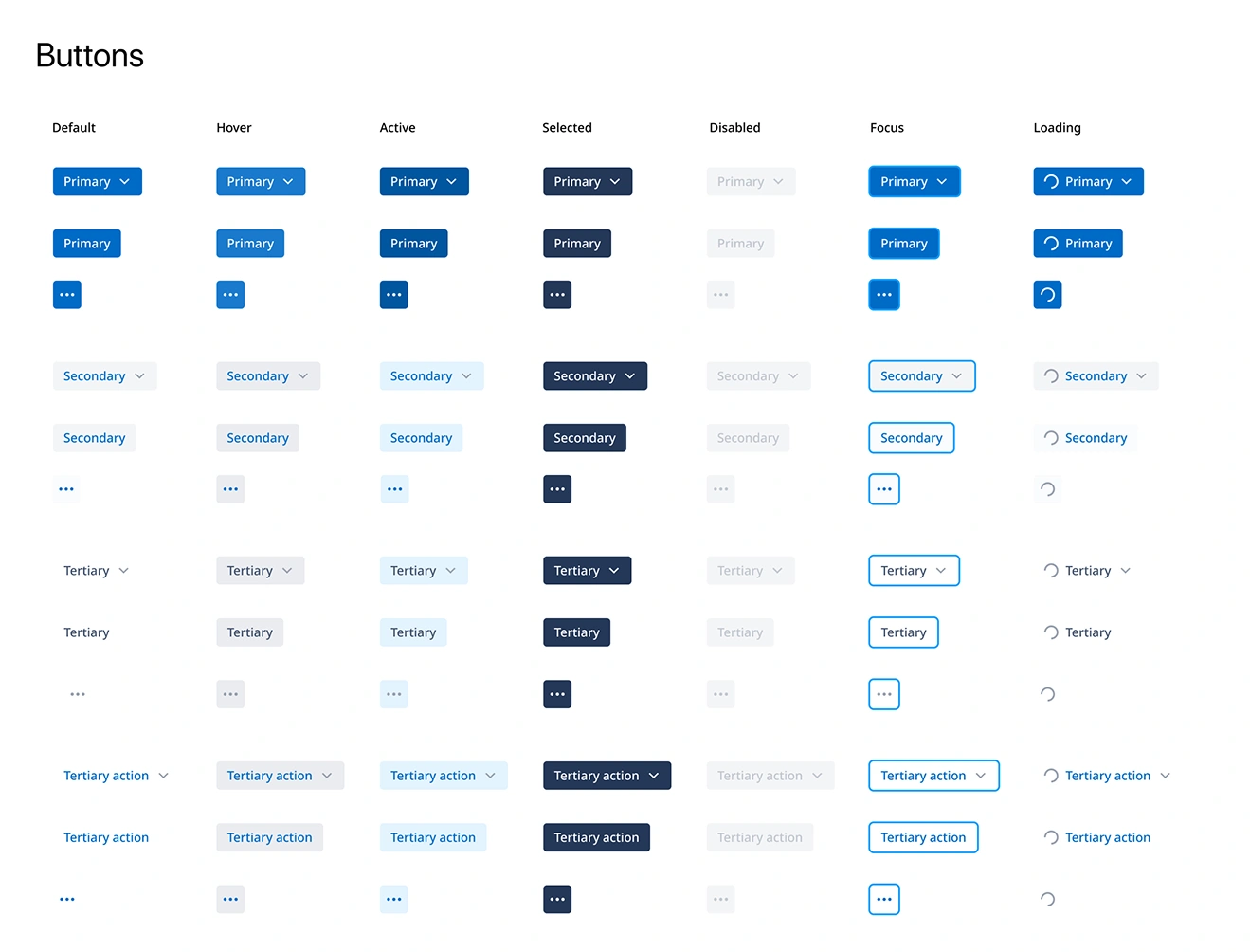
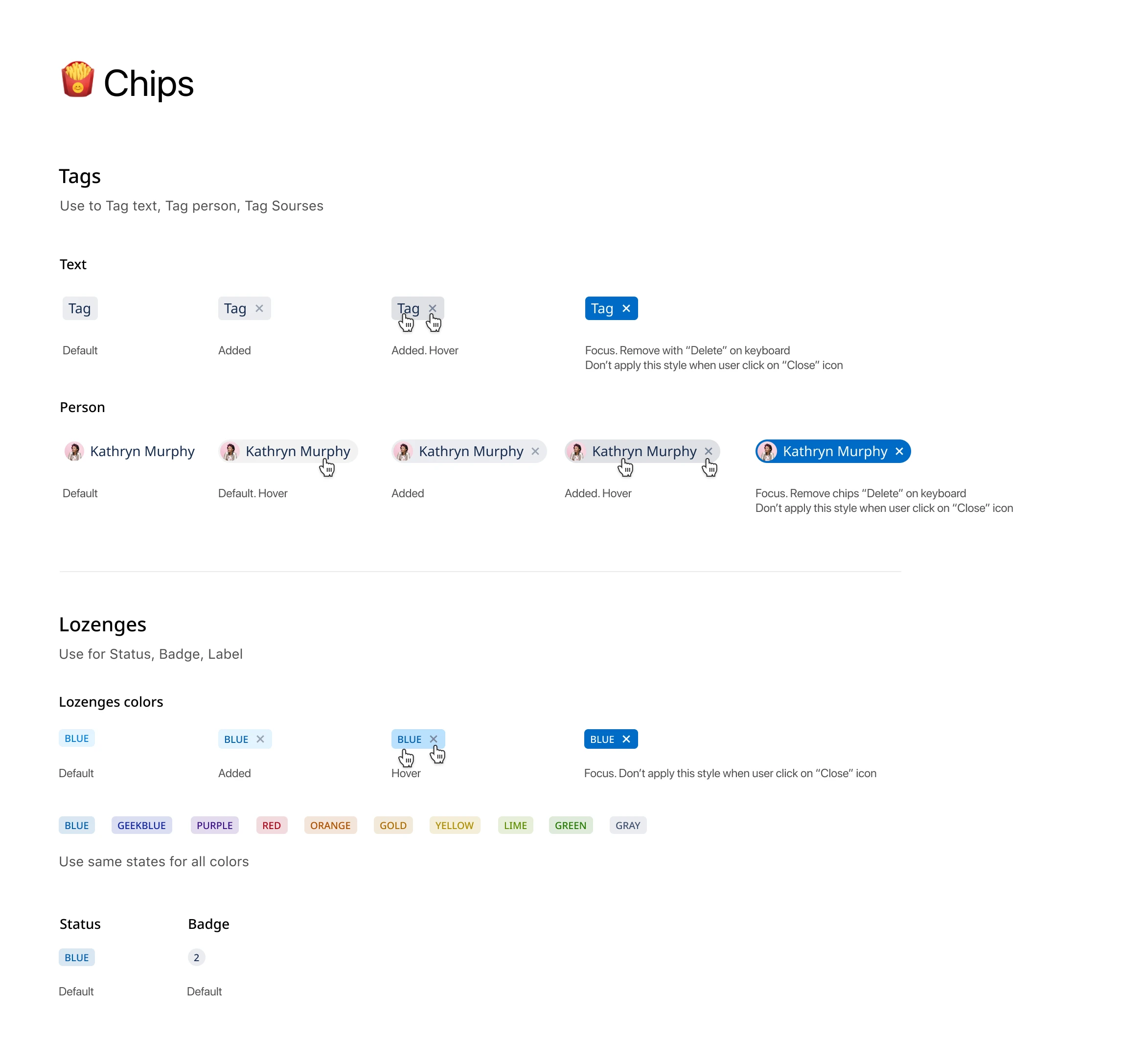
With support from a UI Designer, we built a style guide from scratch for the Angular application. Components were stored in Figma, documented in Confluence, and deployed to Storybook. We also created general guidelines to support design decisions and maintain consistent quality. Storybook helped us test the components. We also planned to make the basic UI components available to partners so they could build integrations with the platform.
Outcome
- Defined the main product concepts and MVP scope through stakeholder sessions, competitive analysis, market research, and user research.
- Conducted around 20 user interviews and usability testing sessions to identify critical problems and insights for the MVP.
- Reduced development time with a scalable, modular design system.
Big kudos to the team ❤️
Arco Westbroek (CPO), Bo Stevens (PO), Inna (UI Designer), and the front-end and back-end teams.
